Can you tell at a glance whether your website’s ignoring these facts and bleeding real $$$?
-
98% of 1st time website visitors leave and never come back. Why?
-
Buyers decide within 6.5 seconds whether a marketer’s message is worth investigating. How?
-
90% of website visitors are performing research and aren’t ready to buy? What do they want?
-
Most new sales prospects have gotten 60% through the buying process and selected front running providers before they ever talk to a live salesperson? How many aren’t calling yours?
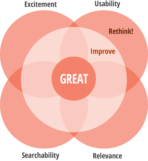
For your website to optimize revenue, relationships, and ROI, FOUR elements must come together at the center in the chart below:

Today, let’s address WEB USABILITY. (Our next three blog posts will address the remaining topics.) Now, you might be asking yourself, why is web usability important? It’s simple. Without WEB USABILITY, USERS LEAVE.
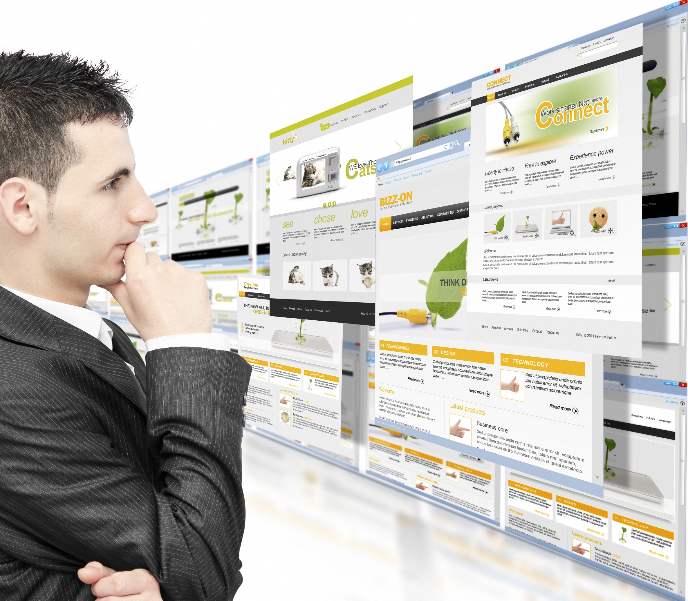
Have you ever tried to cruise through a baffling website filled with dead ends, “buy it now” demands, and lengthy forms you must fill out? How long did you stay on that site? Most visitors depart within 6 seconds if they can’t get moving towards what they need.
Web Usability helps fix this. It’s the art and science of simplification - making websites, easy and intuitive for the end user. Typically, usability begins during the web strategy and design planning process with the support of a user experience designer. It’s improved over time when observing website analytics and fact-based vs gut-feel improvement opportunities.
To optimize usability, let's analyze the following six web usability tips that will be critical for your success:
Tip 1. Great vs. Terrible Design? Users Won't Tell You
 Most users won't tell you if you have developed a great web site, or if your website is terrible. If they like it, they stay. If they hate it, they leave. Since they won’t tell you, the responsibility is yours to harness modern online marketing tools to observe their clicks and actions as they move through your website. You can also ask them for feedback and motivate them to give you their information in return for the valuable offers you provide. Your web analytics will tell the story, as will focus groups ore individuals you observe actually using your website.
Tip 2. Web Usability It's not a Project
Some people think that web usability is a one-time project that you conduct and forget. The truth is, web user experiences need to be constantly reviewed by looking at your website’s key performance data. Let’s say your goal is to increase the number of event registrations, or the number of incoming leads, or the ability to tell your salespeople what their key prospects are looking for on your site. Or you want to know what web visitors download, and how often they visit… or _______ (Your Goal Here). These performance data will provide you with valuable insights on what you should enhance in your website.
Tip 3. Test!
You might want to create A/B testing experiment within your website to see if Page A, or Page B converts at higher levels. Its not just what you say, but how you say it that generates higher levels of conversion. Often, negative headlines perform better than positive ones (Positive Example: “Attributes of winning headlines.” Negative: “Top mistakes of website headlines.”) Or, let’s say we had a poorly performing event registration landing page. When we added testimonials, a larger registration button, and an arrow to the registration, we saw a 40% increase in event registrations.
Tip 4. Observe industry Trends
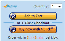
 Keep an eye on user experience trends. If a highly regarded corporation finds a technique that is helping increase conversions, why re-invent the wheel? Take for example, 1 CLICK PURCHASING. Amazon introduced this easy way for people to buy. It works amazingly well for them, so why not for you? Other player have tested other strategies such us Touch-Screen Devices, Guest Checkout, Mobile Responsive Sites, Site Search, Blogs and more. Someone starts the trend and others quickly follow. I am not recommending to always copy, but copy what works and apply it in your world so you don't go crazy trying to reinvent the wheel.
Tip 5. Less is More
The fewer clicks you require on your website, the easier it will be to navigate and comprehend. Always remember, 1 click is the best, 2 clicks if you have to, 3 clicks if you must. The fewer clicks the more USER FRIENDLY AND MEMORABLE your site will be.
TIP 6. Evaluate when you are at
If your company is missing one of the four elements shown in the chart above, there no doubt you’re losing $$$ minute by minute, hour by hour. Probably, you are losing way more than it would cost you to fix the problem. You most likely have a financial advisor, lawyer, or board member that brings a fresh and experienced perspective to your opportunities and threats.Why go it alone, especially in the fast-changing, confusing, and opportunity-rich world of internet marketing?
What if just one easy-to-implement idea could transform your entire user experience and make your site...
... more user-friendly?
... more exciting?
... easier to search?
... more relevant to the buying process?


